# React Guide
# Sticky background
The <StScrolly> component fundamentally act as a content distributor to layout different parts of your scrolly. It does this through the use of render props thus allowing users to flexibly include any content they want. We will start with a simple example consisting of just one sticky background.

import React from 'react'
import './DemoSticky.scss'

import '@st-graphics/react-scrolly/dist/bundle.css'
import StScrolly from '@st-graphics/react-scrolly'

function DemoSticky (props) {
  const renderBackground = (
    <div className="centered">This is a sticky background</div>
  )
  return (
    <StScrolly className="demo-sticky" renderBackground={renderBackground}></StScrolly>
  )
}

export default DemoSticky
2
3
4
5
6
7
8
9
10
11
12
13
14
15
16
.demo-sticky {
  // control sticky distance by setting slide height
  .slide {
    height: 800px;
  }
}
2
3
4
5
6
TIP
Place sticky background content in the renderBackground prop. Any kind of JSX content can be passed in (single node, multi nodes, text etc). props.renderBackground can even be a function which we will elaborate further.
TIP
The scroll distance over which background content stays sticky is specified by adding a height CSS property on the .slide class. You might wonder where does the .slide class come in. This will be explained further in later parts.
# Basic structure
The following is more complete example showing the use of the different slots.
# Using props.renderBackground, props.renderForeground & props.children
import React from 'react'
import './DemoSlots.scss'

import '@st-graphics/react-scrolly/dist/bundle.css'
import StScrolly from '@st-graphics/react-scrolly'

function DemoSlots (props) {
  const renderBackground = (
    <div className="centered">This is a sticky background</div>
  )

  const renderForeground = (
    <div className="centered">This is a sticky foreground</div>
  )

  const slides = [(
    <div className="slide">
      <div className="card">Slide 1</div>
    </div>
  ), (
    <div className="slide">
      <div className="card">Slide 2</div>
    </div>
  ), (
    <div className="slide">
      <div className="card">Slide 3</div>
    </div>
  )]

  return (
    <StScrolly className="demo-slots"
      renderBackground={renderBackground}
      renderForeground={renderForeground}>
      {slides}
    </StScrolly>
  )
}

export default DemoSlots
2
3
4
5
6
7
8
9
10
11
12
13
14
15
16
17
18
19
20
21
22
23
24
25
26
27
28
29
30
31
32
33
34
35
36
37
38
39
Sometimes, we want our sticky content to be in the foreground. The only change needed is putting them in the renderForeground prop instead. In between foreground & background is our slides content. Slides are static positioned containers that follow the normal flow of your document. Contrasted with their sticky couterparts, they behaves like any other "scrollable" parts of your document.
TIP
slides content are passed as children into the scrolly component (between opening and closing tag).
Rules of Slide
<div>tags should be used for slide elements as we require slide to be block elements.- There should be no gap (
margin-topormargin-bottom) between adjacent slide elements. - The
.slideclass is optional, you can use any CSS selector to set a fixed height on the slide. Alternative is to have slide height implicitly set by the slide content.
WARNING
- Avoid using
vhfor slide height. Always use a static value (eg. 800px) for height or let it be implicit by slide content. We will talk a bit more on this later.
TIP
When no children is provided (as in the Sticky background example), the fallback content will be an empty slide container: <div class="slide"></div>. By setting height property of this empty container, user can control the sticky scroll distance.
# Dynamic content
The most important feature of any scrolly is having view state tied to scroll position. Among scrolly libraries, there have generally been two approaches:
- Imperatively specify the position at which a scene change should be triggered (eg. ScrollMagic)
- The "declarative" way. Let specific elements' position relative to viewport determine when to trigger view state change (eg. Scrollama). For example you may want initiate an animation when a block of paragraph scroll into view.
The 2nd approach is more developer-friendly as it automatically handles the reflow of content at different screen size and taps on newer browser capabilities like Intersection Observer API. This is the approach we have taken.
Under the React framework, we are able to bring the declarative approach further. Most scrolly libraries use an API similar to Intersection Observer where you register callbacks that is executed when scroll reaches certain positions. Our approach on the other hand exposes a reactive variable that represents the current scroll state which React can use declarative;y in its render function. This variable is called slideIndex.
# Using slideIndex when render props are in function form
When prop.renderBackground takes a function form, the function receives an object containing the slideIndex property. It is an integer value that changes based on the current slide in the viewport. Conceptually, "slide" is analagous to "scene" in ScrollMagic, "step" in Scrollama and "target element" in Intersection Observer.
import React from 'react'
import './DemoSlideIndex.scss'

import '@st-graphics/react-scrolly/dist/bundle.css'
import StScrolly, {clamp} from '@st-graphics/react-scrolly'

const slides = [
  {text: 'Slide 1', bgStyle: {backgroundColor: 'red'}},
  {text: 'Slide 2', bgStyle: {backgroundColor: 'green'}},
  {text: 'Slide 3', bgStyle: {backgroundColor: 'blue'}}
]

function DemoSlideIndex (props) {
  const renderBackground = ({slideIndex}) => (
    <div style={getBgStyle(slideIndex)}>
      <div className="centered">This is a sticky background</div>
    </div>
  )

  const $slides = slides.map((slide, i) => (
    <div className="slide" key={i}>
      <div className="card">{slide.text}</div>
    </div>
  ))

  return (
    <StScrolly className="demo-slide-index"
      renderBackground={renderBackground}>
      {$slides}
    </StScrolly>
  )
}

function getBgStyle (slideIndex) {
  const clampedIndex = clamp(slideIndex, 0, slides.length - 1)
  return slides[clampedIndex].bgStyle
}

export default DemoSlideIndex
2
3
4
5
6
7
8
9
10
11
12
13
14
15
16
17
18
19
20
21
22
23
24
25
26
27
28
29
30
31
32
33
34
35
36
37
38
39
.demo-slide-index {
  // control trigger points by setting slide height
  .slide {
    height: 800px;
  }
}
2
3
4
5
6
TIP
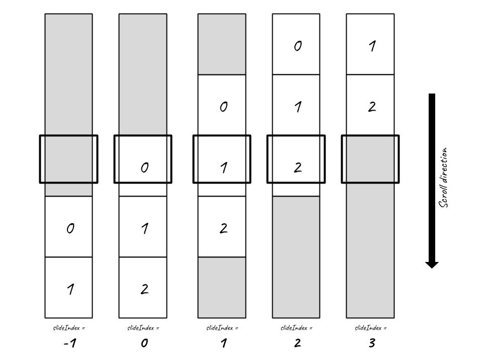
In the example above, we have 3 slides. slideIndex which can be accessed from the first argument of props.renderBackground can take 5 states: -1, 0, 1, 2 & 3. Background style can be assigned declaratively by referencing the slideIndex variable.
About slideIndex
The number of states slideIndex can take is always 2 more than the number of slides (N + 2). This is because we need to account for the state before the first slide enter and the state after the last slide exit. Sometimes a scrolly may occupies the entire length of the page. More often the scrolly is somewhere in the middle with there might be static content before and after the scrolly.
- Prior to first slide scrolling into view,
slideIndexwill be -1 - Upon first slide,
slideIndexwill become 0 - Everytime a new slide scroll into view,
slideIndexwill increment +1 - By the time we reach the last slide,
slideIndexwill be N - 1 - After the last slide scroll out,
slideIndexwill be N - Between 0 and N - 1, scrolly is considered active. Contents inside
backgroundandforegroundslots will be sticky
TIP
Often user might prefer to work with a clamped version of slideIndex. As shown in the example above, background style is only defined for slideIndex between 0 to 2. When slideIndex is outside of this range, we want to just use the nearest index. A convenient helper function clamp is provided this purpose. To use it:
import StScroly, {clamp} from '@st-graphics/react-scrolly'

const clampedIndex = clamp(slideIndex, min, max)
2
3
TIP
slideIndex can be accessed not only from props.renderBackground slot scope. It works the same with props.renderForeground and props.children. Any render props content can be made dynamic through the reactive slideIndex variable. Other useful variables accompany slideIndex. Refer to API for the full list.
# Adjust trigger points
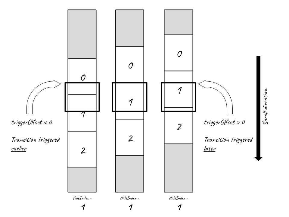
Intersection Observer API provides a rootMargin to fine-tune when a trigger should be fired. Sometimes, user may want the state transition to happen before the target element enters viewport. Our library has a similar concept called triggerOffset. It is one of the props you can set on the scrolly component <StScrolly triggerOffset={customTriggerOffset}>. By default, slideIndex increment when the top of the slide is align with the top of the window. With triggerOffset you can offset this "trigger point".
# Using props.triggerOffset
import React, {useState, useCallback} from 'react'
import './DemoTriggerOffset.scss'

import '@st-graphics/react-scrolly/dist/bundle.css'
import StScrolly, {clamp} from '@st-graphics/react-scrolly'

const slides = [
  {text: 'Slide 1', bgStyle: {backgroundColor: 'red'}},
  {text: 'Slide 2', bgStyle: {backgroundColor: 'green'}},
  {text: 'Slide 3', bgStyle: {backgroundColor: 'blue'}}
]

function DemoTriggerOffset (props) {
  const [triggerOffset, setTriggerOffset] = useState(-200)

  const onChange = useCallback(e => {
    setTriggerOffset(+e.target.value)
  }, [])

  const renderForeground = ({slideIndex}) => (
    <div className="centered">
      <div className="card">{getText(slideIndex)}</div>
      <label>
        Offset =
        <input type="number" min="-200" max="100" step="100"
          value={triggerOffset}
          onChange={onChange} />
      </label>
    </div>
  )

  const $slides = slides.map((slide, i) => (
    <div className="slide" key={i} style={slide.bgStyle}></div>
  ))

  return (
    <StScrolly className="demo-trigger-offset"
      triggerOffset={triggerOffset}
      renderForeground={renderForeground}>
      {$slides}
    </StScrolly>
  )
}

function getText (slideIndex) {
  const clampedIndex = clamp(slideIndex, 0, slides.length - 1)
  return slides[clampedIndex].text
}

export default DemoTriggerOffset
2
3
4
5
6
7
8
9
10
11
12
13
14
15
16
17
18
19
20
21
22
23
24
25
26
27
28
29
30
31
32
33
34
35
36
37
38
39
40
41
42
43
44
45
46
47
48
49
50
About triggerOffset
Negative triggerOffset will make slide transition happens earlier (i.e. before the top of the slide reach the top of the window) while positive triggerOffset will delay slide transition (i.e. after top of the slide has scroll past the top of the window).
# Positioning the sticky window
By default, the sticky background and foreground containers take up the full length of the viewport. This can be modified using props.windowTop and props.windowHeight.
# Using props.windowHeight & props.windowTop
import React, {useState, useEffect} from 'react'
import './DemoWindow.scss'

import '@st-graphics/react-scrolly/dist/bundle.css'
import StScrolly from '@st-graphics/react-scrolly'

function DemoWindow (props) {
  const [vh, setVh] = useState(0)
  useEffect(() => {
    setVh(window.innerHeight / 100)
  }, [])

  const renderBackground = (
    <div className="centered">This is a sticky background</div>
  )
  return (
    <StScrolly className="demo-window"
      renderBackground={renderBackground}
      windowHeight={60 * vh}
      windowTop={20 * vh}>
    </StScrolly>
  )
}

export default DemoWindow
2
3
4
5
6
7
8
9
10
11
12
13
14
15
16
17
18
19
20
21
22
23
24
25
# Smooth transition
Mike Bostock (creator D3) explained in the article How To Scroll that transition between scenes can be time-based (instantaneous trigger) or position-based. With time-based transition once a scroll threshold is reached, scene transition is triggered immediately and runs over a fixed time duration. Position-based transition on the other hand runs over a scroll distance. slideIndex can be seen as a form of trigger for time-based transition. To use position-based trigger, we provide two other reactive variables enter & exit. As with slideIndex, they can be accessed from the argument of render props in function form.
# Using enter & exit when render props are in function form
import React from 'react'
import './DemoEnterExit.scss'

import '@st-graphics/react-scrolly/dist/bundle.css'
import StScrolly from '@st-graphics/react-scrolly'

const slides = [
  {text: 'Slide 1', bgStyle: {backgroundColor: 'red'}},
  {text: 'Slide 2', bgStyle: {backgroundColor: 'green'}},
  {text: 'Slide 3', bgStyle: {backgroundColor: 'blue'}}
]

function DemoEnterExit (props) {
  const renderBackground = ({enter, exit}) => slides.map((slide, i) => (
    <div key={i} style={getBgStyle(i, enter, exit)}>
      <div class="centered">This is a sticky background</div>
    </div>
  ))

  const $slides = slides.map((slide, i) => (
    <div className="slide" key={i}>
      <div className="card">{slide.text}</div>
    </div>
  ))

  return (
    <StScrolly className="demo-enter-exit"
      renderBackground={renderBackground}>
      {$slides}
    </StScrolly>
  )
}

function getBgStyle (index, enter, exit) {
  const opacity = enter(index, 400) * exit(index, 400)
  return {
    ...slides[index].bgStyle,
    opacity
  }
}

export default DemoEnterExit
2
3
4
5
6
7
8
9
10
11
12
13
14
15
16
17
18
19
20
21
22
23
24
25
26
27
28
29
30
31
32
33
34
35
36
37
38
39
40
41
42
.demo-enter-exit {
  // stack background layers on top of each other
  .background > div {
    position: absolute;
    left: 0;
    top: 0;
    right: 0;
    bottom: 0;
    opacity: 0;
    mix-blend-mode: overlay;
  }
}
2
3
4
5
6
7
8
9
10
11
12
About enter & exit
Unlike slideIndex which is an integer, enter & exit is a pair of function which can be used together or individually to implement smooth transition. The functions have the following signature:
type t = number // t ∈ [0, 1]
declare function enter (index: number, distance?: number, offset?: number): t
declare function exit (index: number, distance?: number, offset?: number): t
2
3
User will pass in slide index i and transition distance d as parameters. The functions will return a number t between 0 to 1.
- When the indexed i slide starts entering, t will be 0
- As the slide enters, t gradually increases to 1
- When the slide completes enter, t will be 1
- When the indexed i slide starts exiting, t will be 1
- As the slide exits, t gradually decreases to 0
- When the slide completes enter, t will be 0
- The length over which t transit from 0 > 1 & 1 > 0 is controlled by the d parameter.
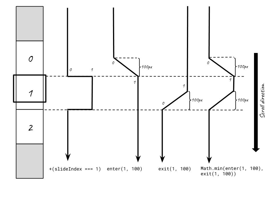
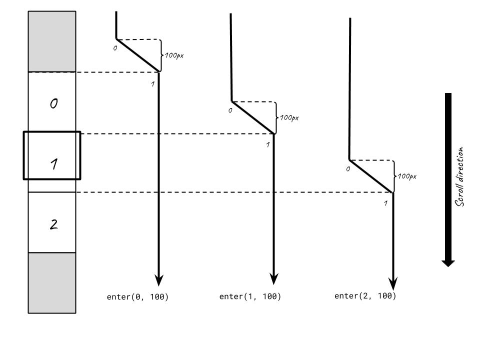
enter(i, d, o) === 1 - exit(i - 1, d, o)
exit(i, d, o) === 1 - enter(i + 1, d, o)
2
TIP
Why does enter/exit output a number between 0 and 1? t ∈ [0, 1] is what we call an interpolation parameter. By passing it into an interpolator function, you can interpolate between any two values. Say you want to interpolate between two numeric values A & B. You can use the linear interpolator t => (1 - t) * A + t * B. More complex interpolators allow you to interpolate non-numeric data types. You can even implement easing by applying one of the Robert Penner's easing functions before passing t into the interpolator. In simple cases such as the CSS property opacity, t can be used directly.
To apply both enter and exit, use the expression Math.min(enter(i, d), exit(i, d))
WARNING
slideIndex should never be used together with enter/exit in the same expression. enter(slideIndex, d) is an anti-pattern and will lead to unexpected outcome. Always use a fixed slide index for each enter/exit call.
# Using progress when render props are in function form
While enter/exit is well suited for use cases like enter and exit transitions, sometimes we want to track scroll progress and enter/exit is not the best tool for this as they are based on a single "anchor point" (controlled by the slide index argument). progress on the other hand has two anchor points start and end therefore we need a different API. progress accessed from the argument of render props in function form is what we need.
import React from 'react'
import './DemoProgress.scss'

import '@st-graphics/react-scrolly/dist/bundle.css'
import StScrolly from '@st-graphics/react-scrolly'

function DemoProgress (props) {
  const renderBackground = ({progress}) => (
    <div className="centered">
      <div className="card">
        <code>progress()</code><br />
        = {format(progress())}
      </div>
      <div className="card">
        <code>progress(true)</code><br />
        = {format(progress(true))}
      </div>
    </div>
  )

  return (
    <StScrolly className="demo-progress"
      renderBackground={renderBackground}>
    </StScrolly>
  )
}

export default DemoProgress

function format (v) {
  return (v * 100).toFixed() + '%'
}
2
3
4
5
6
7
8
9
10
11
12
13
14
15
16
17
18
19
20
21
22
23
24
25
26
27
28
29
30
31
32
About progress
Like enter & exit, progress is a function that returns a number between 0 to 1:
type t = number // t ∈ [0, 1]
declare function progress (alignBottom?: boolean, offset?: number): t
2
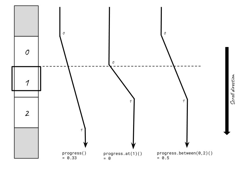
However, it is different from enter/exit in that instead of defining a slide index and a scroll distance (to anchor the transition), progress lets you define both the start and the end.
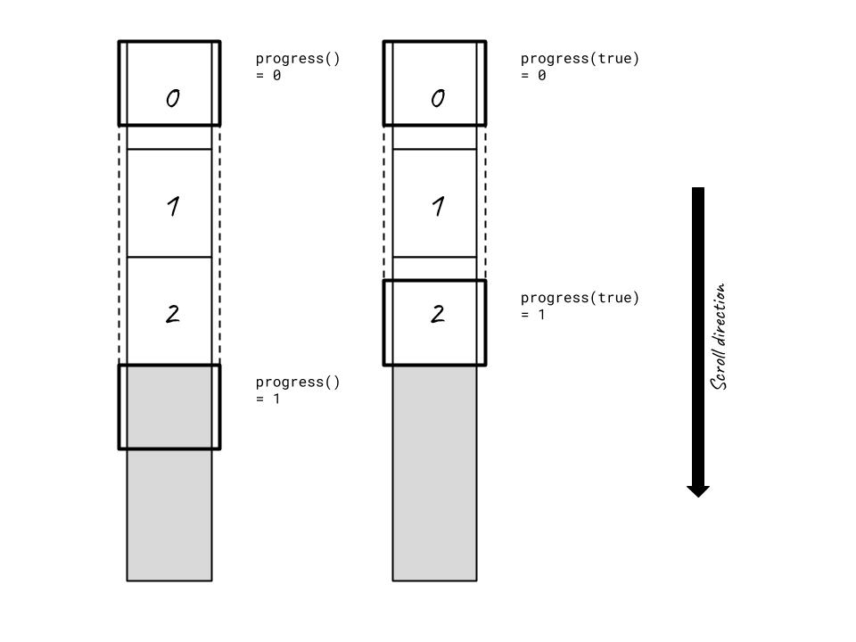
You can call the function without providing any argument. By default, start is upon the first slide entering and end is upon the last slide exiting.
Sometimes we want to track scroll progress during which content is sticky. But sticky content do not "unstick" when the last slide completely exit (when top of window aligns with bottom of last slide): they "unsticky" when the bottom of the window aligns with the bottom of the last slide. See diagram below.
To fix this, progress's first argument is a boolean flag to indicate progress should end when bottom of the last slide aligns with bottom of window instead of top.
To track progress only on certain slides, you can use the .at or .between modifiers. See examples below. .between works the same as .slice on array.
# FAQs
# Why can't I use vh for slide height?
An often encountered bug for new users is slideIndex jumping unexpectedly from one value to another when keyboard drawer opens and closes on Android browsers. This is almost always the result of setting slide height based on vh. We will breakdown how this problem arises:
- User interaction on certain elements (eg. ) causes keyboard drawer to open.
- This trigger a window resize event which shrink
window.innerHeightby an amount equal to the keyboard drawer height. Correspondinglyvhdecreases. - Since slide height is defined using
vh, every slide will have their height decreased. slideIndexis computed using scroll offset and slide heights. Browser keeps scroll offset constant but the decreased slide heights pull forward all the trigger points.- Hence
slideIndexjumps to a higher value. It appears as if scroll position jumps to the bottom of the scrolly - When user closes the keyboard, the reverse happens and scroll jumps back to a position above.
The solution: change slide height to a static value (eg. 800px).